Breif:
Colour in design can be approached objectively from a ‘scientific/technical standpoint, or from
a subjective emotional/psychological ‘artistic’ perspective. The aim of this mini project is to allow you become familiar with some of the basics of ‘Colour Theory’, whilst also developing a personal and emotional approach to colour.
For this project you will be be capturing the colour palletes to be found in and around the Parkside building.
To help you do this first download the Adobe Capture App (iPhone/ Android) to your mobile phone. You will be using it to map colour palettes of the house exterior/interior and grounds.
COLOUR theory
Interaction-design.org define Colour Theory as "The collection of rules and guidelines which designers use to communicate with users through appealing colour schemes in visual interfaces. To pick the best colours every time, designers use a colour wheel and refer to extensive collected knowledge about human optical ability, psychology, culture and more"
|
|
The colour blue
The colour 'Blue' for me holds a very special place in my heart. Not only is it my favourite colour but it hold and represents such great memories of Summer and the sea and the sky for me. Blue is one of the three primary colours, it lies between violet and green on the spectrum of visible light. According to wikipedia "The eye perceives blue when observing light with a dominant wavelength between approximately 450 and 495 nanometers"
I chose the colour 'Blue' because of the emotions it represents within design being Serenity or calmness and used anywhere in architecture where the space is supposed to be relaxed. For example spas, reception waiting areas or swimming pools and gyms.
I chose the colour 'Blue' because of the emotions it represents within design being Serenity or calmness and used anywhere in architecture where the space is supposed to be relaxed. For example spas, reception waiting areas or swimming pools and gyms.
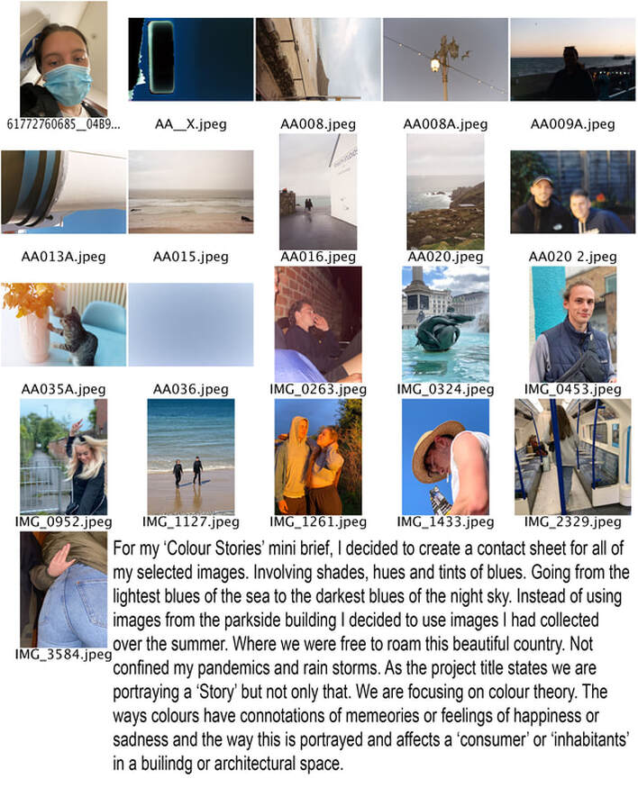
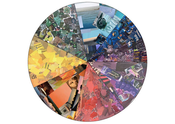
I went on with these images to create a colour segment for a group colour wheel project we were making. I again did the colour blue with the images I had collected.
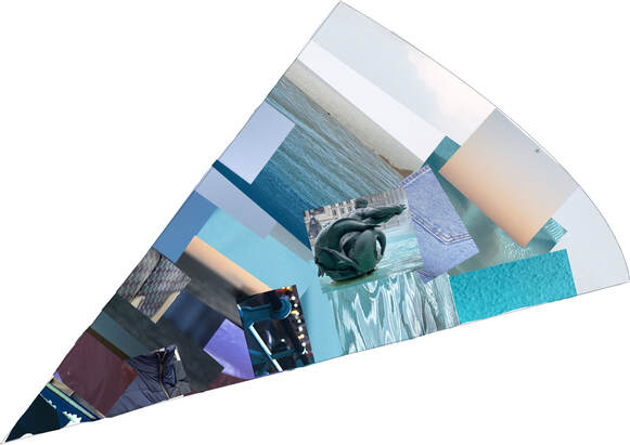
The images had to go from light on the outside and gradually dark towards the centre. If I was to do this colour wheel again I would focus on my editing skills using photoshop to create a cleaner shape for the segment. Also to edit the hues of the colours to create a more gradual fade outwards.
|
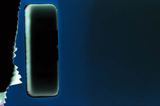
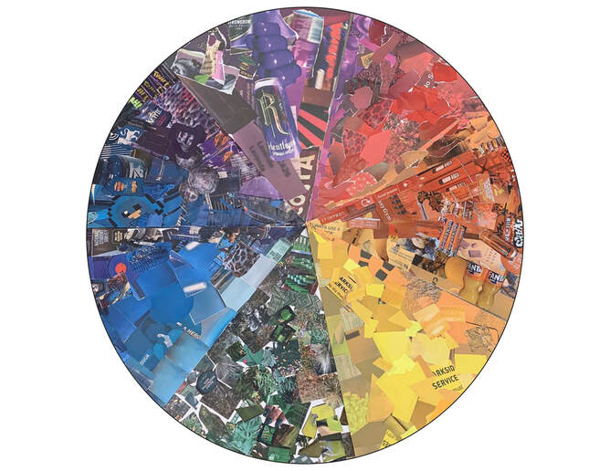
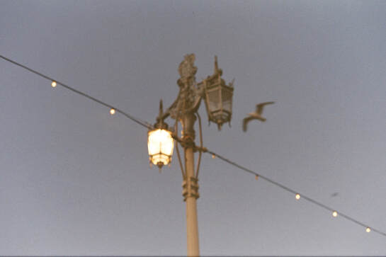
Above is my favourite blue image that I had taken on my film camera that had been damaged but I think it creates the perfect blue. Below is my segment edited with everyone else's. Some people used physical collages and and others used photoshop like me.
|